a selection of trailers that have type on it, this can show just how varied they are when it comes to selecting an adequate font face.
The text overlaps the movie whilst it's still playing, for this reason they have had to ensure that the film is kept quite dark so they would be able to read the information through-out the trailer
The paranormal trailer looks at a selection of shots that may look into key frames and stuff.
The experience of the project has been a mixed ride from day one. Upon meeting the members and creating the group, it would seem like things could only go well. After the introductions were made and we went to collect our own research, we found complications began to arise. Primarily were the members of the group didn’t attend. It left us somewhat disadvantaged because of certain expectations that couldn’t be met. For saying this was a group project, from the original 7, only three were consistent throughout.
Working with a group will always have its complications. It can be because of miss communication or just mismatch of personality.
The way in which the other people attacked the project was interesting. I’m used to being more reserved and structured, yet found myself liking their method or working. Still demanding, yet somehow it felt freer. Coming from a Graphic Design background, I am used to tight design and working once again with Graphic Designers reminded me of that.
After several weeks, our synch began to fade. Less and less people started to make it to the group meetings. Each week, felt like we were taking one step forward and two back. When people turned it, they didn’t like what was done so we had to change. Eventually, we realised this wasn’t a way to work and therefore changed the choices. Those who didn’t attend didn’t have a say. It seemed tough and strict at the time, yet seemed to convey the message across.
Overall, I’m not sure how I’ve felt. Whether it’s the way we have approached the work, the different styles involved or redoing things over and over constantly. I’ve learnt the technique of Rotoscoping and found out how demanding it actually is. Although the motion is accurate, the length to create the final piece is a lengthy one.
Given the overall effect, I am pleased with how it turned out. I think those who attended mostly have worked well and it has been reflected in the final piece.
This advert came out at the right time with the animation. I don't know what the train thing is called, however, know that it was very useful to look at the squashing of the body. I came across it one day watching tv, and knew that it would be something which could influence both my camera angles and the movement of this machinery.
I wanted to use Charlie Chaplin's Train robbery, because it was based on the heist. Although not exactly based on the same concept as our heist (using horses instead of carriage) the way the pull it and the exaggaeration of the characters acting is what helps it and makes it what it is. I like the black and white appeal as well as the sooty texture you can get- somewhat grainy, something seen less commonly in todays animations/videos.
This isn't quite the scene I wanted to base it off, because I was looking for the film one NOT the videgame, no matter though. The concept still remains.... there is a heist and you have to solve it. The background design work is similar to what we have done as are the extra pieces in the landscape. Overall, you could say that this is one of my influential pieces.
At the begining of the project, we were going to do a project based on the Alice theme that I had created. Unfortunately to do artistic difference, and influences from other members the design got simplified and had to be changed. I do like the film effect that I applied. I still believe
This song has a catchy tune. It seems that this is the perfect time to launch this product. The choo choo bar and the choo choo song ( Trainline) would go perfectly hand in hand. It also gives me the idea of taking the choo choo audio and playing it on a continuos loop for the animation. Lately major business are promoting trains etc... if there was ever a time to launch this bar- IT'S NOW!
This is a test I used for the animation. I was only given one image to work on, so used the liquify tool on Photoshop to attempt to create some bending and motion on the animation. Sadly it doesn't work that well, but the rotoscope is a major improvement.
This video is what I used as reference for my rotoscope. We took it in turns to see who would look better and the ways each of us would interpret getting hit by water. It was a fun activity and was good to see we didn't take each other to seriously.
This is the one I did... .Unfortunately i didn't achieve the desired effect and it resembled me 'pawing' at the water in some cat manner. Although very comical, I don't think it would have benefited the animation well
This is just a test to see how the character moves from side to side. I'm trying to make sure that the timing works well and it isn't off.
I have found that the first animation doesn't work so well. There seems to be a sudden jump when it goes from the back to the side. In this preview, I have incorporated the use of a middle shot, which should hopefully make the transition a little smoother.
I used the walk cycle which can be found in the Animators Survival Guide. Overall I think that it was very helpful as I came to understand how to animate the character. The book really does what it say on the front and it was thanks to this, that I was able to create my walk cycle.
I wanted to see in this test, if I would be able to get away with using a simple static background and working with the character. Although he only appears to be walking on the spot at the moment. I think that with some minor tweaks, I should be able to give the illusion of someone walking into the distance.
Although my character is female, I wanted to see what the movement would be look( referencing the looking over the shoulder). I know that I have included a quick sketch in the RVJ however, believe that capturing on film is always better.
In a lot of Japanese animation, you can see a character jump back and hold this stance as a self defense mechanism. Although sometimes it can be seen serious, I am hoping to add a little twist to make it somewhat humorous.
This is also part of the reference on how the walk looks from behind. I have also incorporated a walk back just incase I decide to include it in the animation.
Moodboard
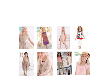
This photo is one that I have decided to use in order to create the character outfit. I have collected the images from Next and will plan to base some of the outfits on it.
This is the animatic that I have created for the animation. I notice that it might go a little quick, however, hopefully you will be able to come to understand what I am trying to achieve. If you want the storyboard- it can be found in my sketchbook along with (paper research).
The only reason for using this- ignoring the audio, is because I needed the reference of someone eating a watermelon. Preferably a child, because this would help me depict what it would look like on my character. Also, the fact that a child tends to eat more messily(could be one of the benefits/behaviors) of my Character (Vlad).
This is a cartoon taken from Scooby Doo. The reason for using it and including it in my blog is because there is some Anticipation in the episode.
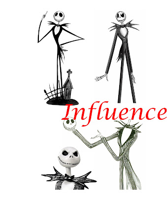
I have used the character design from Jack Skellington as my influence for the Vlad character design. The reason for using this character is, for the over exaggeration of the legs. Overall, I hope that this will help and I should be able to achieve the desired look for my character.
Influencing Animation
I love the design of this animation. I don't know whether it was created on flash or another software however- the simplicity of the character design is very appealing. One thing that I have noted is that the animation uses constant Anticipation, something which I also am planning to use on my animation. The colours are a little too vivid for me at the moment, and would probably tone it down a little. Perhaps the use of blues and purples would work well in the animation. I like the smoothness of it, and style of drawing. Effective yet simplistic.